Calling
For Action
Pitt Men's Basketball Marketing Materials
Designing a Sales Plan
Sometimes the most vital components of a marketing and sales strategy are the smallest elements. That is precisely the case for our friends at University of Pittsburgh.
Each year we work their marketing department to put together print and digital ads that promote single-game tickets, season tickets, mini-plans, holiday packs, and special events. The goal is to create something engaging, enticing, and thematically consistent when reaching the target audience. Whether fans are in their seats at Petersen Events Center, using public transportation, navigating the internet, or reading the newspaper, they will be presented with a concise call-to-action that drives them to Pitt's ticket buying platforms.
A STROKE OF BRILLIANCE
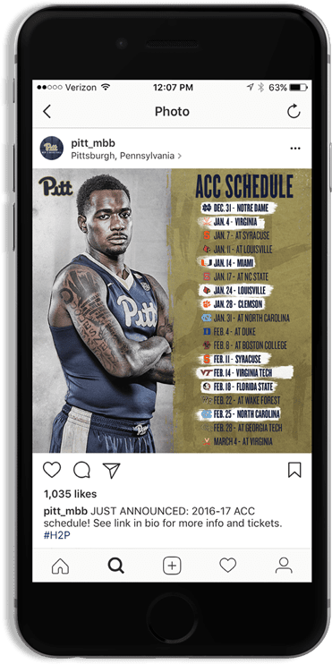
When it comes to large-scale campaigns, our starting point can vary. In this instance, the look-and-feel of the Pittsburgh Men's Basketball materials was established at a granular level: the official ACC schedule announcements on social media.
Though it can seem like a very straightforward piece, we had to be mindful that the look that we established for the first piece would easily translate to all sizes and media.
This poses a very unique challenge. We needed design elements that embodied Pittsburgh Men's Basketball, former Head Coach Kevin Stallings, the city as a whole and would give us flexibility to grow the campaign on the fly. Simultaneously, Pitt had recently rebranded their entire athletic department and these graphics would be one of the first moments that many Pitt Basketball fans see the new uniforms. The program was painting a picture of rebirth and strength.
This is a blue collar team that was looking to leave their mark in the ACC and in the record books. We strategically used paint strokes to segment the artwork and created a "Hail 2 Pitt" mark (#H2P) that is prominently featured across all pieces. We had a plan, a design, and we were ready for tip-off.
We worked with Summit on all men's basketball marketing materials, advertising, social media and digital releases for the 2016-17 season. This provided us with a consistent look and feel throughout the season, across all platforms and helped us streamline the process from design to print and release. Fans definitely took notice and we look forward to continuing our partnership!
ASSISTANT DIRECTOR OF MARKETINGRyan Maerder
Precision and Execution
With an established design, Ryan simply needed to provide us his advertising needs and we took care of the rest. We quickly turned around bundles of digital ads, social graphics, campus signage, billboards, newspaper ads, coupons, and much more.
This look-and-feel applied to standard ticket promotions like single-game tickets and mini-plans, but we needed to modify the design for special events: the Zoo Holiday Pack and #PittRetro. This gave us the opportunity to specialize the artwork for these events, capitalize on a tremendous theme, and showcase the Summit re-branded Oakland Zoo t-shirt to the masses!
